Visual texts are all about communicating a message to an audience for a purpose.
As you create a visual and verbal text, you will need to make choices and decisions about WHO you are trying to communicate with (audience), WHAT you are trying to say and WHY you want to say it (purpose).
Once you’ve decided what your message is and who it needs to get to – then you can begin thinking about HOW you will communicate it. What colours will you choose? What dominant image would grab their attention and tell them about your idea? What words will help build that idea? What typeface? How big will the words be? Where will you position the words? What do you want them to see first? Second? How will you keep your ideas clear?
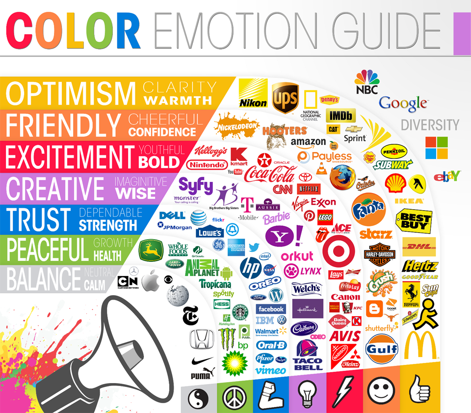
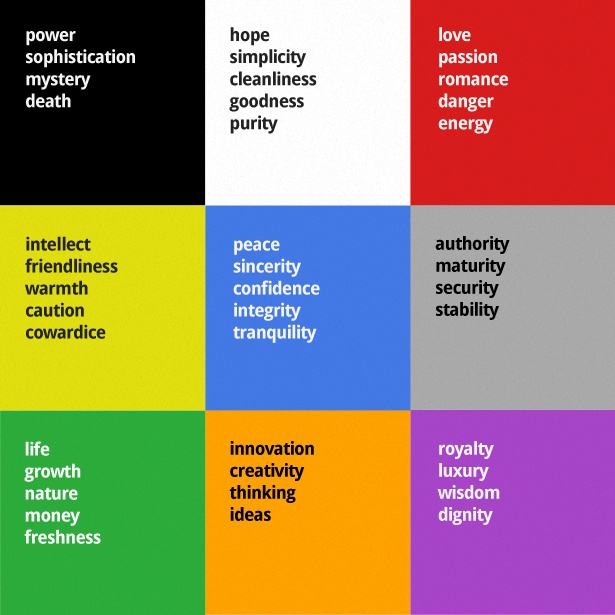
Colours matter!

From WebDesignDepot:

Here is a link to the original webpage for further info on some well-known logos:
Choose a youth issue to make a poster about.
(Not suicide, abortion or marijuana).
| Achievement with Excellence | Achievement with Merit | Achievement |
| * Develop and structure ideas effectively in a visual text.• Use language features appropriate to purpose and audience with control to command attention | • Develop and structure ideas convincingly in a visual text. • Use language features appropriate to purpose and audience with control. | • Develop and structure ideas in a visual text. • Use language features appropriate to purpose and audience. |
* Develop and structure ideas effectively in a visual text.
- Use language features appropriate to purpose and audience with control to command
- The text must include visual and verbal components. The text must be an original construction by the student. The components may either be original, adapted or taken from other texts or
- Visual text types at this level may include posters, graphic or illustrated texts, visual displays , web pages, live or recorded dramatic presentations, videos and other appropriate visual text types. Texts are expected to be stand alone in nature rather than being a component within an oral presentation.
- Ideas may include information, opinions, recounted experiences or events, observations, arguments, interpretations, narrative, thoughts or
- Develop and structure ideas means building on ideas by adding details or examples, and working towards a planned
- Develop and structure ideas convincingly means that the development of the ideas and structure is generally credible and
- Develop and structure ideas effectively means that the development of the ideas and structure is compelling and well-organised.
- Language features include:• visual (eg images, sequence, costumes, movement)• verbal (eg dialogue, quotations).
- Use language features means to select visual and verbal features that are appropriate to purpose and
- Use language features with control means that language features and presentation techniques are selected and linked to the intended purpose and
- Use language features to command attention is demonstrated through the delivery of a confident and sustained text.
My TOPIC is:
The message I am trying to communicate about this topic is (write a sentence):
Important details that link to my main idea are (use quotes, slogans, statistics, bylines, added info, etc):
1.
2.
How can I present these details in a way that will make my audience notice and understand them?
The people who I am trying to reach are:
What types of visual or verbal features will these people notice and understand?
How will I make my visual and verbal features work together to build my main idea?
How will I decide what to include and how to organize all the elements to “wow” my audience?
| VISUAL | VERBAL | ||
| Shapecolour | symbolsrepetition | punsimile | bylinerhyme |
| compositionbalance | contrastlayout | metaphoralliteration | repetitionminor sentence |
| white spaceborders | graphiclogo | quotationsimperative | statisticspersonification |
| foregroundbackground | fontsize | punctuationpersonal pronoun | hyperboletestimonial |
| dominant image lines | law of thirds | slogan | |
EXAMPLE
| VISUAL | Visual effects Verbal effects | VERBAL | ||
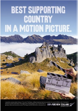
| Colour, lines, logo – black > | Black band at the bottom links into NZ brand and logo of the silver fern, also frames the picture. Black is repeated in the clapper board. | The ‘100% Pure NZ’ slogan promises pristine scenery and links to the scenic picture (dominant image). | <Slogan | |
| The visual and verbal features must work together to make the message clear to the audience. The message should be an invitation to ACTION. E.g. Come visit NZ! We are proven amazing! | ||||
| Layout, border> | The positioning of the writing sits in the black band and keeps all the written information tidy. It anchors the page. | The written information tells more of the story of why ‘you’ should visit. | <Written info about NZ | |
| Headline font, colour, size – white > | White faded colour of words, links into natural cloud colour in the picture. This matching colour links the ideas in the words to the scenic picture. Font is strong, practical but not showy – just like NZ and NZers. | The pun on the Oscar award proves that NZ landscapes played an important role in LOTR success. This works as an invitation for fans or tourists to value spending time here. | <“Best supporting..” headline. Pun on the Academy award title. | |
| Dominant image- scenery > | Beautiful NZ scenery made famous by LOTRImportant information to allow customers LOTR to make contact, a call to action. | <Website address | ||
| Foreground – someone holding a clapper board > | Clapper board signifies the Hollywood connection. Reminds audience how exciting it would be to visit NZ since it is ‘a movie star’. | |||
